Learning Plan 4: CSS Media Queries

CSS Technologies — Natasha Scott

Overview of Learning Plan 4

Bottom Up Design Challenge

Bottom up challenge screenshot

Description

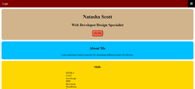
A mobile-first homepage built for smartphones with no additional breakpoints for tablet or desktop — pure mobile-first design.

Reflection

I had only done one mobile-first site before this, using Bootstrap. This plan significantly expanded my mobile-first knowledge. Still need more practice at this approach.

CSS Media Query Project

Media queries project screenshot

Description

A fully responsive web page using a grid view layout — designed to adapt cleanly across desktops, tablets, and mobile phones.

Reflection

This was my first time using media queries for orientation changes. I'm very familiar with media queries generally but need more float and grid-view practice.